


Five In A Bath
An average man will not get so very many opportunities to squirm into a bathtub with four wet and soapy naked women; these are the rigs of the times, and there’s precious little to be done about it. Just don’t ever let one of those rare opportunities pass you up, that’s all I ask:
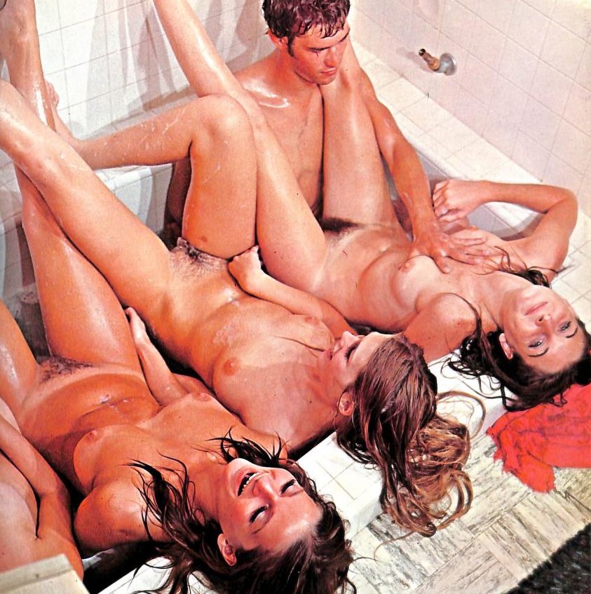
The bathtub itself is one of those very square inbuilts that we used to see more often in the mid-20th. I haven’t seen one myself since the Nymph and I stayed in a particular run-down EconoLodge in Bellingham, Washington that was overdue for updating in the early aughts. If you wanted a king sized bed (which we did — can you say “new relationship energy”?) you needed their jacuzzi suite, and their jacuzzi was a deep square tiled pit that looked a lot like the tub in this photo, although its faucets and fixtures were more luxurious.
Photos are described as “scenes from a yet-untitled film” in an otherwise undated 1970 issue of Cinema Scorchers magazine.
Similar Sex Blogging:
Shorter URL for sharing: https://www.erosblog.com/?p=33872

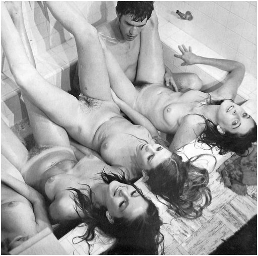
The 70’s definitely looked better in black and white.
JA, remember that they, too, had a pornocalypse problem in their commercial developing labs. The very best color developing (and printing, for magazine pubication work) required machines that cost millions of dollars, and the legal risks involved in developing or printing porn meant that few who had that kind of capital invested were willing to risk it. So porn in color in that era was getting shoddy work done by shady people on second-tier equipment on the late shift, very possibly by untrained operators whose bosses were not aware of the shenanigans taking place in the building. Whereas at the same time, top-quality developing and printing in black and white could be done on inexpensive equipment that was everywhere to be found, with master-craftsman operators just as easy to find.
Interesting point. I didn’t know or remember that, Bacchus.
I remember old friend.
Porn mags of that era would be mainly black and white, with a the cover and centre spread in garish colour like the image above. I guess just the cost of colour was prohibitive.
I’m a big fan of black and white. Still take pictures with my 1982 Minolta and develop them in the bathroom. The colours are better in black and white. Like the pictures are better on the radio.
You know, then. But it’s not just the power of imagination, as some who read this may be thinking. I’m not a photography nerd but I know some photography nerds, and if you get a serious black-and-white partisan really wound up with a few drinks in him, he’ll start talking about grains and particles and throwing jargon around and the bottom line is that in some important ways, the well-wrought black and white photograph captures the structure of an image in a better way, such that the colors of our imagination have more to work with.
I’m not saying that’s true, I’m saying that serious fans of black and white photography believe it.
I’m not a serious photographer, but I did take nice picture of oranges on the tree in the garden. The oranges felt very orange and the leaves very green.
Going back to the photos above. I would much rather rub my soapy hands over the silky skin of the girls (and the boy) in the second image. I think in the colour image they might have been exposed to radiation and their skin might just fall off.
LOL
Well I am a serious photographer, and trust me it doesn’t need a few drinks.
One thing rarely mentioned even by the hard core is that the eye sees mostly in luminance (b&w). Detail comes from contrast, and that mostly from luminance. Lots of reasons why b&w can be more impactful start from that, so it’s not just a belief thing, it is true based on how the eye and brain work.
I also used to work in prepress and print and did a major colour migration in the 90s for a household name publication. All other variables aside, and there are lots, flesh tones, relying on small tonal gradations, often in pale colours (for paler skins, not of course for all skin tones) have always been a sod to reproduce, so colour tends to get the contrast raised, and darker tones printed to fight ‘dot loss’ and colour skew. Raising the contrast in mono often looks better not worse. The printing at the time reflects the best that could be done in the time and budget with the technology available probably, with no reflection on the competency of the operators. The technologies from pressing the shutter through to binding the impressions have come on leaps and bounds, and reduced in cost massively, such that full colour now is orders of magnitude easier and better.
Just for fun… and to demonstrate some of the issues. If you have a colour printer to hand. Take a picture of your favourite subject. I’m assuming you have a camera in your phone, or a camera proper. Print on photo paper. Then take the same file, convert to a GIF without palette optimisation, then print on plain 80gsm white paper. Then convert original to mono, adjusting contrast and brightness and print again on plain paper. You now have in front of you an approximation of what we can do now in magazines with cheap coated stocks, faster drying inks and ubiquitous colour management versus 1970s kind of printing.